https://basicappleguy.com/basicappleblog/macos-golden-gate-icon-comparison
A comparison of macOS icons between Tahoe and Golden Gate beta 1 shows updated colors, sharper edges, and changed Liquid Glass effects. Design changes are visible in icons like Finder, Journal, and App Store. The final look remains uncertain due to early-beta status.
Publisher: Basic Apple Guy | Apple Wallpapers, Reviews, and Merch — Opinion / commentary.
Image:
Image: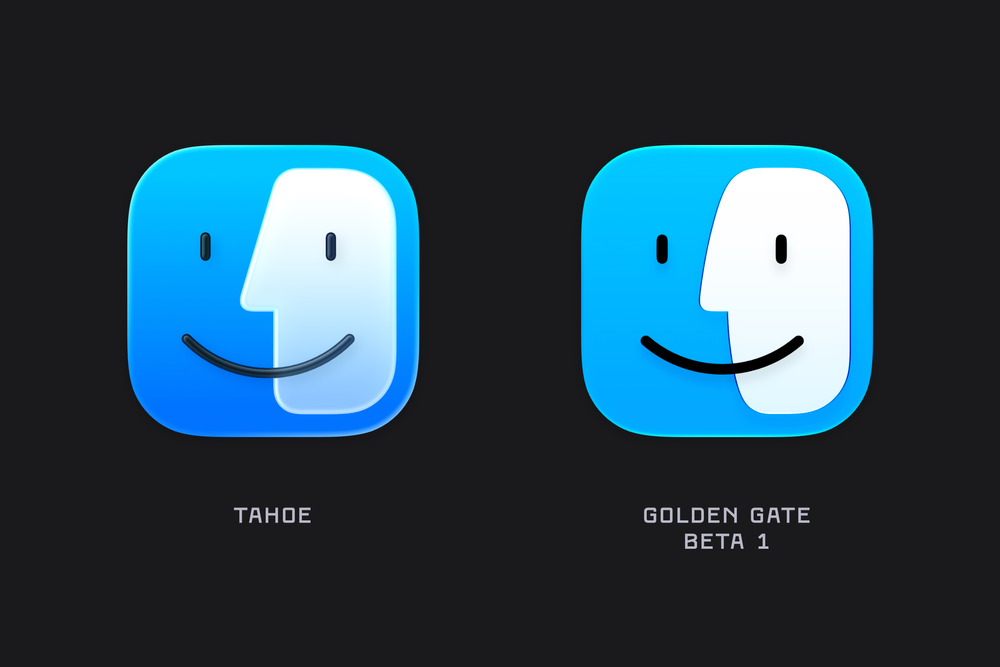
Image: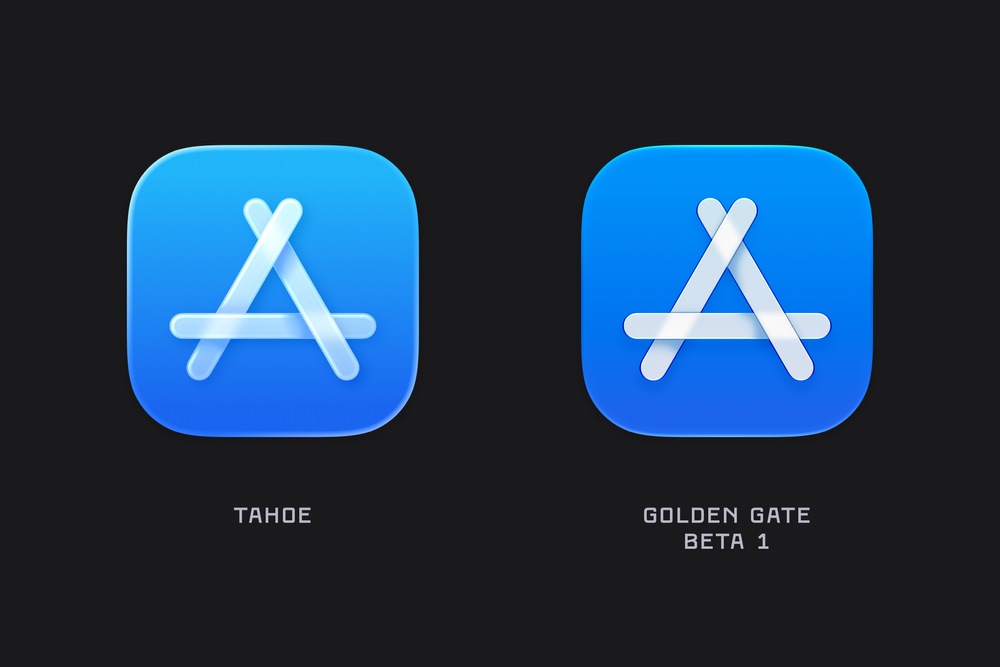
#macos #icons #apple #design
A comparison of macOS icons between Tahoe and Golden Gate beta 1 shows updated colors, sharper edges, and changed Liquid Glass effects. Design changes are visible in icons like Finder, Journal, and App Store. The final look remains uncertain due to early-beta status.
Publisher: Basic Apple Guy | Apple Wallpapers, Reviews, and Merch — Opinion / commentary.
Image:
Image:
Image:
#macos #icons #apple #design
Views: 2
Categories: Articles & Guides [c4], Projects & Resources [c5]